Material Design is a design system created by Google, that prescribes the size, color, spacing, and other aspects of how views and layouts should look and behave.
Or in other words it's a system of guidelines, components and tools that support best practices of user interface design.
As you know Xamarin enables us to develop and deploy applications across multiple platforms such and iOS and Android. So sometimes it's important to keep the identical look and behavior of same applications across multiple platforms, that can be easily achieved with Xamarin.Forms Material Visual. (Thanks to Xamarin.Forms Material Visual 😍)
Xamarin.Forms Visual enables renders to be selectively applied to VisualElement objects without having to subclass Xamarin.Forms Views.
How to implement material design rules to Xamarin
Xamarin.Forms Material Visual can be used to apply Material Design rules to Xamarin.Forms applications. When setting the Visual="Material", Material visual is enabled and all the supported views adopt the same design, and create a same look and feel in each platform.
Steps to implement Material Design in Xamarin.Form
Create a new Xamarin forms project or open an existing project
Add Xamarin.Forms.Visual.Material Nuget package to you iOS and Android platform projects.


Install-Package Xamarin.Forms.Visual.Material
Initialize material visual in each of the platform project
1. Initialize material visual in android
Open MainActivity.cs then add this line Xamarin.Forms.FormsMaterial.Init after the Xamarin.Forms.Forms.Init
2. Initialize material visual in iOS
Open AppDelegate.cs then add this line Xamarin.Forms.FormsMaterial.Init after the Xamarin.Forms.Forms.Init
Apply Material Visual
To enable Material Visual, set the VisualElement.Visual property on the page or view to Material.
<ContentPage Visual="Material"
             ...>
    ...
</ContentPage>
The Visual property is defined in the VisualElement class, with views inheriting the Visual property value from their parents. Therefore, setting the Visual property on a ContentPage ensures that any supported views in the page will use that Visual. In addition, the Visual property can be overridden on a view. Reference : Microsoft Docs
Important Note: On Android, Material Visual requires a minimum version of 5.0 (API 21) or greater, and a TargetFramework of version 9.0 (API 28). In addition, your platform project requires Android support libraries 28.0.0 or greater, and its theme needs to inherit from a Material Components theme or continue to inherit from an AppCompat theme. For more information, see Getting started with Material Components for Android.
Controls supported by Material Visual
ActivityIndicator
Button
CheckBox
DatePicker
Editor
Entry
Frame
Picker
ProgressBar
Slider
Stepper
TimePicker
Let's do some work with Material Design 🥳, Browse my Github to view the complete source code
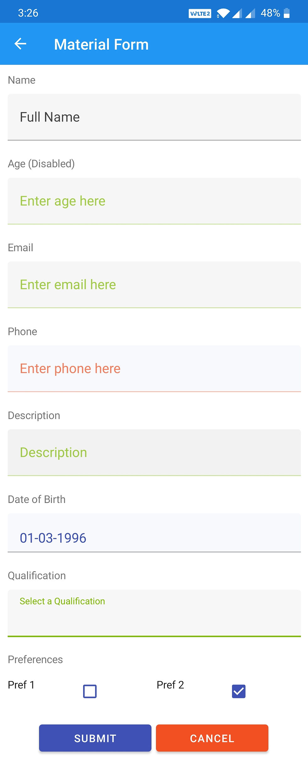
Material Form
Here let's find the difference between Material and Non Material form


Here is the code for this layout.
Material Visual element for this page is enabled by setting the visual property of this ContentPage to material. (Visual="Material")
Material Card

Card containers hold all card elements, and their size is determined by the space those elements occupy. Card elevation is expressed by the container.
The above layout can be achieved by this xaml code,
Here ImageResourceExtension is to handle the embedded resource (for images in this demo)
Which is included in the contentPage as xmlns:local="clr-namespace:MaterialVisual"
<ContentPage
             ..................
             xmlns:local="clr-namespace:MaterialVisual"
             ..................
             ..................
             Title="Material Card">
And used as below for image MaterialCard.jpg is located under Assets folder in the shared project.
<Image Source="{local:ImageResource  MaterialVisual.Assets.MaterialCard.jpg}"
                           Margin="-16,-16,-16,0"
                           Aspect="AspectFill" />
You can also set the visual property for any controls if you want a specifically for a single components not for entire page, here is the example for button
<Button Visual="Material" Text="more" HorizontalOptions="End"
                            BackgroundColor="{StaticResource QuaternaryColor}" />
To Disable material appearance for a single component you can set it to default
<Button Visual="Default" Text="more" HorizontalOptions="End" BackgroundColor="{StaticResource QuaternaryColor}" />
Kommentare